Resources Our platform
How to own your future on the premium open internet

Recruiting fraud is a growing issue for many companies.
The Trade Desk takes this issue seriously and is taking steps to address it.
Our platform
In previous installments, we’ve covered myths around frequency and components needed for evaluating it effectively. Now we’re going to learn ways to successfully navigate the data and uncover the optimal frequency for your brand’s advertising campaigns.
Share:
There are many high-level resources outlining ideal frequency across verticals and goals, but the reality is that frequency is subjective. There is no one-size-fits-all approach — each campaign’s optimal frequency will depend on the advertiser’s product or service, creative, desired outcome, ad environment, and targeting strategies. We propose that you follow a more data-driven approach rather than using general frequency benchmarks for the duration of a campaign. You can utilize benchmarks to start, of course, but should learn to rely on your campaign data as you grow.
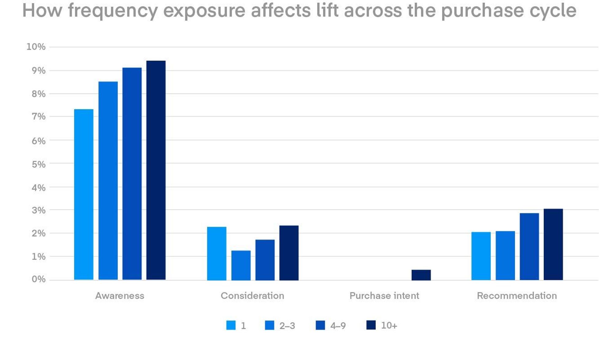
Using research that The Trade Desk conducted together with Lucid, a Cint Group company, we examined the way exposure frequency impacted the lift percentage across the purchase journey.
Frequency benchmarks can also vary by channel. Below we took the frequency cliff of several e‑commerce brands to set benchmarks by channel:
Next we’re going to run through how you can fine-tune your frequency preferences step by step, with the ultimate goal of maximizing ROI. We want to emphasize that this is an iterative process — you should review these preferences regularly to improve your results and drive more positive customer experiences. You can (and should) also augment this process by letting machine learning models crunch all your data, freeing you up to think contextually and intuitively.
Whenever possible, we recommend optimizing toward measurable business outcomes like ROI or ROAS — that’s where this strategy works best. At the very least, you should aim to calibrate frequency based on CPA goals, which reflect a major milestone in the customer experience (e.g., building a car, submitting a quote, or downloading a white paper). Marketers who have no goal, or simple reach goals, tend to focus on effective CPM (eCPM), which emphasizes buying the cheapest inventory. This has consequences for brand performance though, because cheap inventory often fails to capture the right consumers’ attention.
By moving away from cost and focusing instead on the value of media, you can foster better consumer experiences. If your brand is already focused on business results, then it’s a perfect time to reflect on what “good” performance looks like and the price tolerance you should expect. While we won’t get into how to set KPI and eCPM thresholds, we do want to underscore that it’s best practice to analyze the relationship between price and performance. Plotting out performance (e.g., CPA) relative to cost (eCPM) can uncover pockets of inventory that are not efficiently delivering outcomes. Conversely, inventory with strong performance could benefit from more volume and higher CPMs to drive incremental performance.
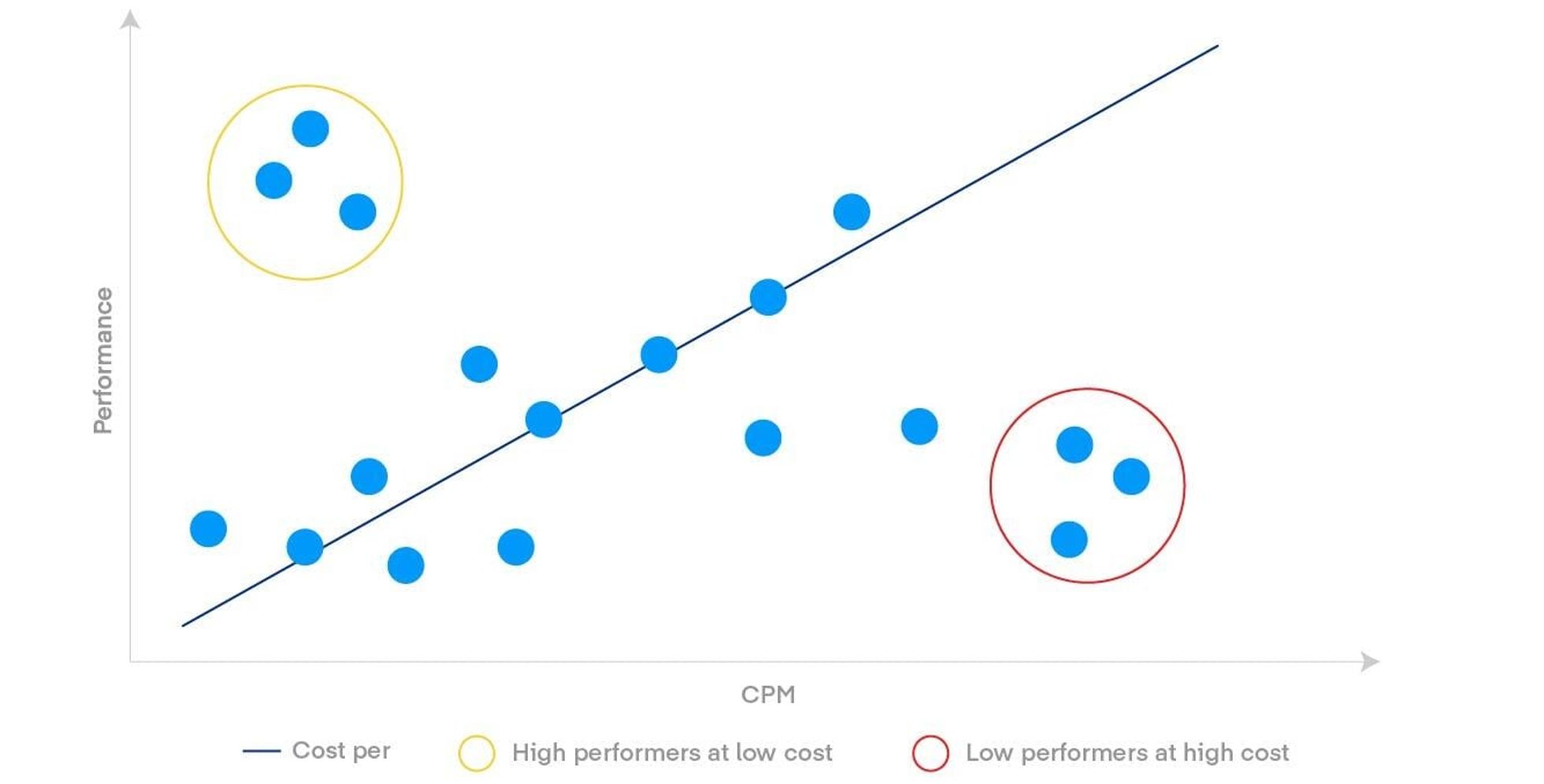
Generally speaking, machine learning algorithms (like Koa™, The Trade Desk’s artificial intelligence) do a fantastic job of analyzing and optimizing the relationship between predicted performance and the cost of individual impressions. These algorithms are purpose-built to determine the best bidding and CPM strategies to maximize your performance. So you can analyze where the algorithms are finding value and use those insights to unlock further opportunity.
For two examples, let’s look at Figure 3 above. The plot points within circle A represent high-performing impressions. For this type of low-cost inventory, you may want to focus on maximizing scale and potentially increasing bids to help uncover pockets of inventory that might not have been considered previously. By contrast, the plot points within circle B show us low-performance, high-cost inventory. For this you can reach into your supply path optimization toolbox and try to shape your buying strategies away from those pockets of impressions.
For inventory that falls outside of circles A and B — well-performing supply directly in line with your performance goals — you can employ frequency-calibration practices, which we outline below.
As we noted, frequency settings are specialized — each brand, product, and campaign launch will have its own optimal frequency. If you have the luxury of analyzing previous campaign data, we recommend you use those insights to inform a new campaign and run a frequency analysis with recent data (e.g., within the last 14 days). For advertisers with limited campaign history, we suggest setting a reasonable frequency cap (using informed benchmarks) at the onset of a campaign, letting the campaign run, and analyzing results once there’s enough time and data to review (typically after one to two weeks).
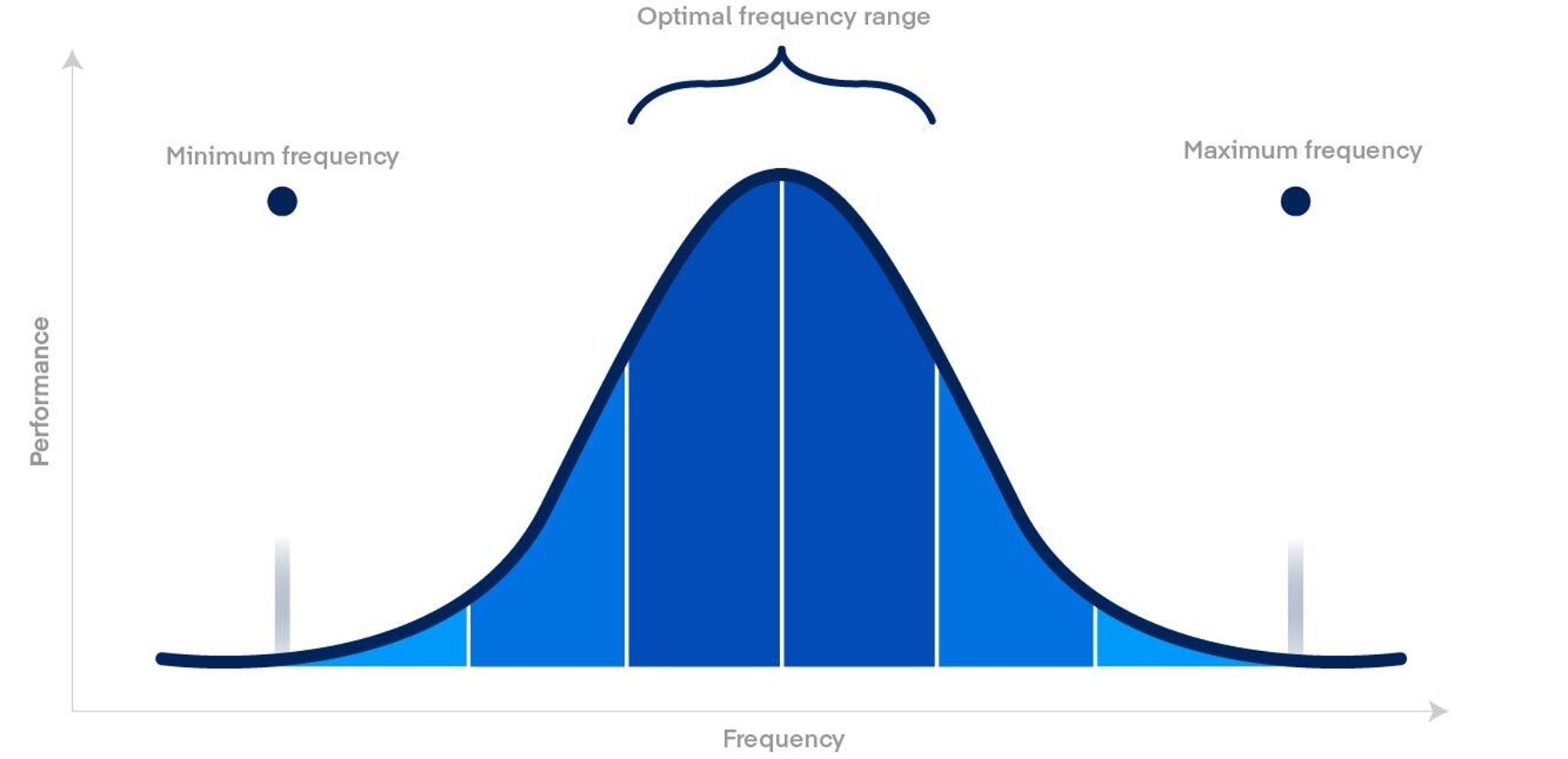
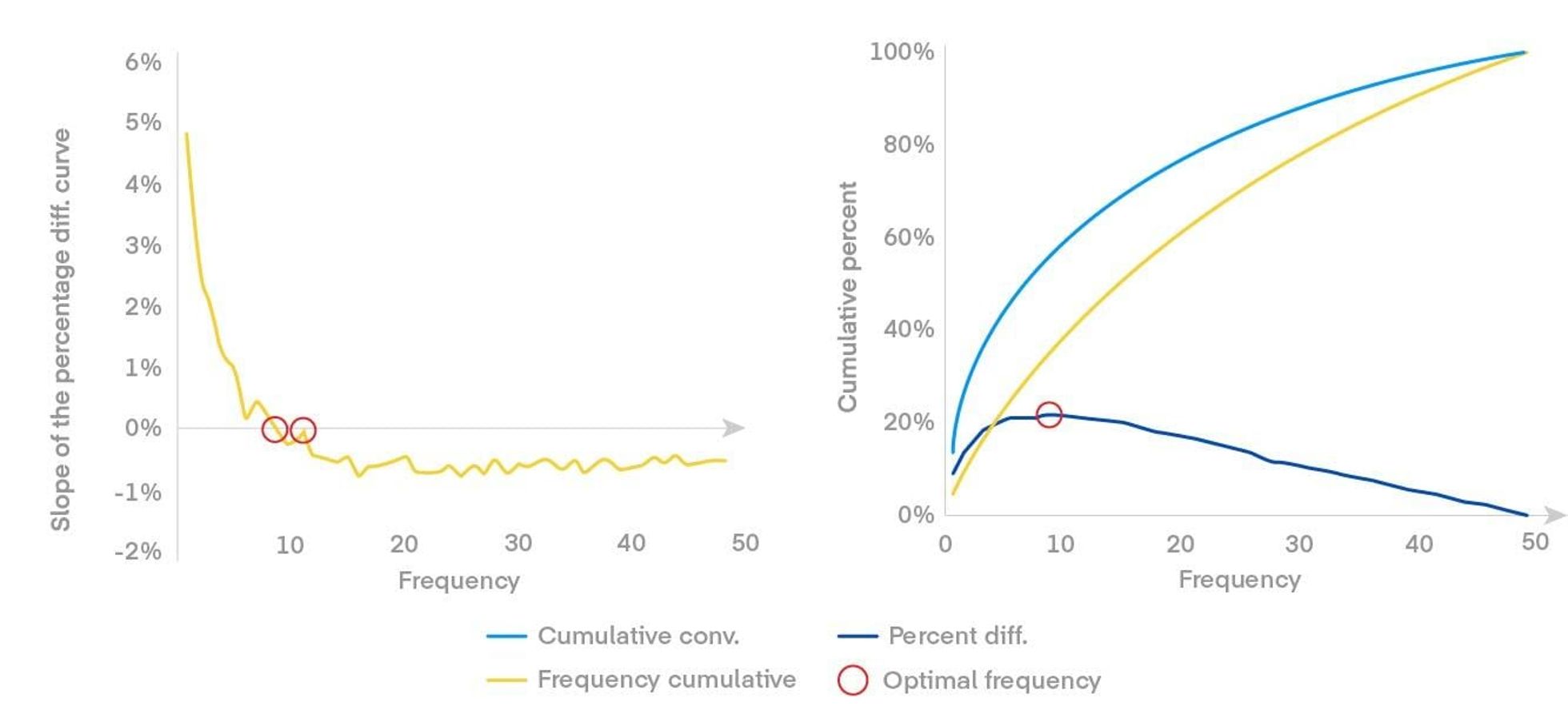
This next step is the focal point of the exercise: finding where the rate of advertising spend exceeds the growth rate of cumulative conversions. In other words, you need to figure out when focusing on frequency (hitting the same audiences again and again) might be less efficient than focusing on reaching net-new audiences (unique reach). This inflection point indicates the moment when increasing frequency may no longer produce incremental results. You can find this point by filtering performance into frequency buckets and identifying the relationship between advertising spend and conversion volume. When mapped out graphically, it can often look like a bell curve (pictured in Figure 2 above) or a more progressive slope with sharp outliers at higher frequency buckets. In either case, this exercise will help you uncover the variables that impact optimal frequency.
When using The Trade Desk reports, follow these steps to map your curve.
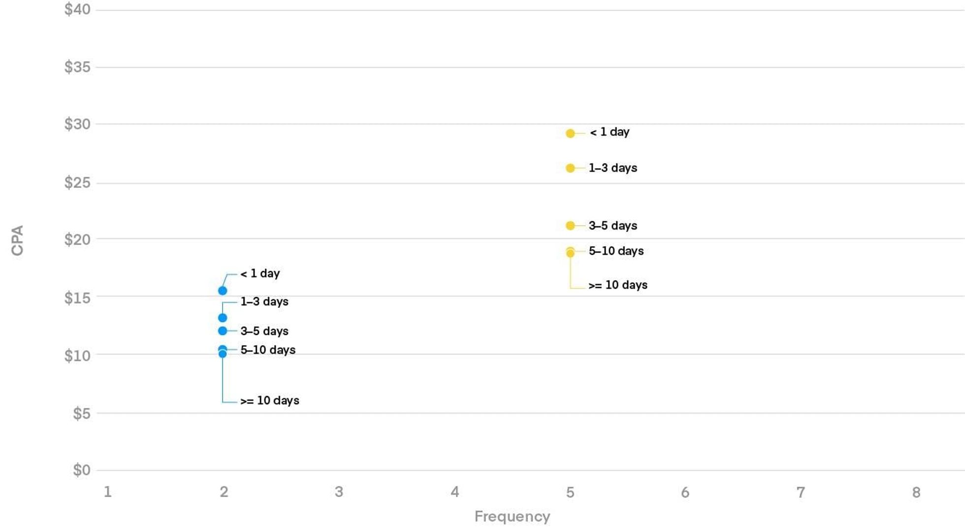
Fig. 5: A table of dummy frequency data, which is what’s required to run a slope/regression analysis to conclude an optimal frequency range.
Using a table like the one in figure 5, you can find the point at which serving more ads does not increase or support performance outcomes and use this as your frequency cap, which typically will be set at a higher level in our campaign hierarchy so the cap manages exposures across campaigns. This is the point in the bell curve where the line is closest to the x‑axis after the curve in Figure 2.
Pro tip: Frequency settings can be managed at many levels using different audience seeds (e.g., first-party data groups). Seeds are a fantastic way to engage different audiences with bespoke messaging at varied frequencies to drive incremental performance. You can use this process to help find optimal frequency across campaigns, ad groups, and audiences, with the ultimate goal of driving maximum performance.
Next, analyze where minimum exposures are being made. (This typically happens in inventory-scarce environments.) You can use this as an opportunity to assess when a specific frequency correlates with higher performance. In this phase, CPMs should also be evaluated to ensure you’re being competitive. The end goal of this phase is to determine a target minimum frequency and make sure the campaign can deliver close to that minimum across all supply. For most campaigns, frequency minimums can be set to “lifetime” timelines.
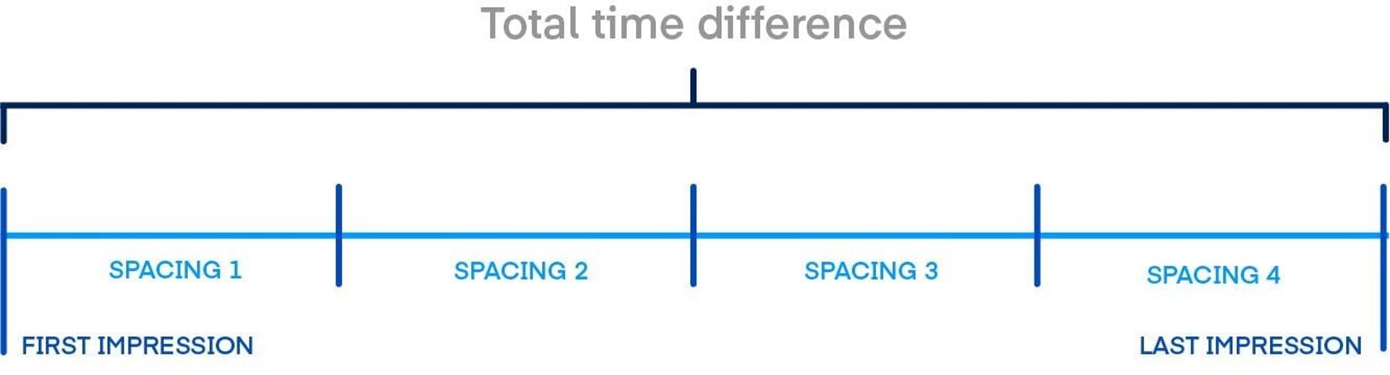
By studying the time between impressions served, you can identify how close impression exposures need to be to drive maximum engagement, ad recall, and bottom-line performance. Delivering impressions too close together or too far apart can have an adverse impact on performance and customer experience. In this advanced step, savvy programmatic practitioners can pull in impression time-stamp data, cross-referencing the frequency buckets shown in Figure 2. This way, you can work toward finding the ideal distribution of impressions within frequency settings to bolster performance. While we won’t dive into details on how to determine optimal impression distance, we have provided an illustrative analysis that can be replicated.
Total N impressions (N>=2) and there are (N‑1) spaces. Then, avg. spacing = T/n or T/(N‑1).
Total N impressions (N>=2) and there are (N‑1) spaces. Then, avg. spacing = T/n or T/(N‑1).
Now that we’ve gone through the steps to effectively evaluate your strategy, remember that maintenance is key. While it can be tempting to just do a “one and done” analysis, it’s critical to reassess optimal frequency at regular intervals (at minimum, monthly). This way, you can continually redirect spend to target and engage new users, driving overall campaign success.
Get additional context by going back to read parts one and two of our series on ideal frequency.
Need help finding your optimal frequency? Our trading team is focused on diving into data with you to maximize your investments across the open internet.
Resources Our platform
Resources Our platform

Resources Data and measurement
